Wednesday, September 1, 2010

Coffret D'or Lipsticks from Spring 2010

It's official. I am in LOVE with Coffret D'or's lipsticks. Over the past few months (NOTE: I wrote this in June...), I've been branching out more into the lip makeup arena and trying out different brands of lipsticks. Because my lips are dry and very pigmented, there is a very small population of lipsticks that work well on me. Plus, I don't like lipsticks that completely cover up my lipcolor (unless they are nude-colored) because I think the effect looks fake, so my selection is even more limited.

After going through the reviews, I picked out a few brands (Dior, Maquillage, and Coffret D'or) that are really popular with the Asian crowd since I tend to identify more with their makeup style. I first tried out Dior Addict High Shine Lipstick because it was the easiest to get in the US. The Dior lipstick wasn't bad, but it was still a bit dry for me and contained shimmer/glitter bits that were too rough. Then, I tried a Maquillage Spring 2010 lipstick, which was definitely creamier/more moisturizing. Still, the shimmer/glitter bits were too scratchy for my liking. Finally, I tried Coffret D'or (CD), and although it's not extremely different from MQ, it has become my favorite.


The packaging for the Spring 2010 line of CD lipsticks is pretty simple and sleek. I'm sort of on the edge about the design, so I don't particular like it but I don't hate it either. The one thing that's annoying about the packaging is that I can't tell which lipstick is which from the outside unless I read the label. I guess that's a minor problem right now since I only have two of these lipsticks, but it would be a nuisance if I buy more and I have to pick up every one of them to check the label.


Previously, I mentioned that the CD lipsticks are not that different from the MQ lipsticks. The minor difference between the two is that CD lipsticks are slightly more moisturizing and doesn't accentuate lip lines as much. I still have a slight problem with the roughness of the shimmer in certain shades of CD lipsticks, but it's minor enough that I can live with it.

The two colors that I bought from CD's spring 2010 Aqua Rouge line were PK 247 (right swatch in below pictures) and PK 248 (left swatch in below pictures). I was originally looking for a versatile neutral pink, and PK 248 seemed like the most neutral color out of the PK series. However, the color turned out to be a neutral-cool medium pink color that's fairly pigmented. I wasn't completely in love at first with the color since it seemed too bright for me, who is used to muted lipcolors, but after working with it, I'm liking the color more and more. In fact, now I love the color when I don't feel like wearing too much eyeshadow since it really brightens the face.

Swatch picture taken in direct sunlight:


Side note: For those not yet familiar with Asian/Japanese lip product naming, PK stands for pink, OR is orange/peach, BE is beige/nude, and BR is darker nude/brown.

I bought PK247 during the phase when I was still experimenting with PK248. I wanted a more muted pink for makeup looks that focus on the eyes, and PK247 was a perfect choice. It's a nude, almost beigey pink. With my pigmented lips, the color looks pinker on my lips than it does on bare skin, but I very much like the effect.

Swatch picture taken in indirect sunlight:


In short: Coffret D'or lipsticks are a great choice when you're looking for moisturizing lipcolor that's not completely opaque. At $28 a pop, they are a bit pricey, but worth the money IMO.

Wednesday, August 18, 2010

Inspiration - Chanel Inimitable Promo

During the past year or so, I have slowly developed into a devoted Chanel fan. I used to love Dior and Guerlain and think that Chanel is boring and for old people, but my attitude has changed 180 degrees. Now, I am in love with the texture of Chanel eyeshadows and blushes (haven't bought one of their blushes yet though) and am curious to try Chanel lipsticks (though I don't really want to spend $30+ on a lipstick since I don't use them very often). In any case, I guess my love for Chanel extends to their promo pics because I am totally in love with their promo pic for the recently released Inimitable Mascara. Though honestly, the foundation/powder on the model's face looks too thick to me when you see a larger version of the picture, but her eye, blush, lips, and hair are just gorgeous. I wouldn't be surprised if her eye had some help from false lashes, but I think half the beauty is in the color of her eyes, which has nothing to do with makeup, of course. I guess it helps that Chanel finds pretty models 'cause this makeup look can make a normal person look like a ghost =P (...it sounds like I'm not really giving much credit to the makeup artists at Chanel...)

Monday, July 26, 2010

Fyrinnae - Round 3

More Fyrinnae! This batch I bought last month so I remember more about the different colors. There's actually a few more that I bought in the same shipment, but because the pictures didn't turn out well for those, I'll be reviewing the remaining colors later.


The star of this batch (for me) is Fire Opal. It's a very interesting blend of sooty gray with copper shimmer. I don't know what an actual fire opal looks like, but the color reminds me of embers from a bonfire or campfire. I also really love Platinum, Starfish, and Sake & Sashimi. Platinum is like a whitened pewter half way between silver and a champagne gold. Starfish is not as unique at first glance, but it is a mauve with gold shimmer that looks slightly coppery when applied. Sake & Sashimi is a tree-bark-colored brown with fine green shimmers. I have no idea why they named it Sake & Sashimi, but the color evokes an imagery of ancient forests for me. The other colors are also gorgeous, but I'll stop babbling ^_^

Here are more pictures under direct sunlight (so you can see the sparkles ^^):


Pictures under indirect sunlight:


Note that I couldn't all of the colors to show up true to life in all of the pictures. Tasmanian Devil looks a bit more pink in reall life, and Android Angel is a very cool purple and not as blue as it appears here. Also, Changeling is a very very dark purpley plum color despite the purple-ness not showing up well in the pictures.

All pictures were taken under natural light.

In short: Fyrinnae is a great go-to store for unique eyeshadow colors!

Saturday, July 17, 2010

Fyrinnae - Round 2

As is usual these days on this blog, here's yet another long overdue post. In fact, this is so long overdue that I don't remember when I actually made this purchase. Probably safe to say it was within the last year though =P


Since I'm so hopelessly bad at describing colors, I'll let the pictures do most of the talking this time. In case you were wondering though, the one swatch that isn't labeled is a duplicate of Wicked, which definitely caused much confusion when I was trying to label this picture today. I think it's safe to say that the colors in the picture are pretty true to life, though I think the pink/red shimmer in Avenging Salem didn't show up very well. The multicolor-ness of the sparkles in Immortality was also not captured well, and so were the sparkles in Lights of Tokyo. (Perhaps partly because I smeared LoT before I took the picture ~><~ One of my fingers accidentally swiped over Hypercool and LoT, which is why you can kind of see that smear mark on Hypercool.)

Here are more pictures taken at different angles:


My favorites out of this batch were Atomic Afterglow, Valhalla, and Immortality. Atomic Afterglow is just this very awesome silvery, rusty pewter color. It's one part silver, one part gold, and one part light green. I'm probably not doing it justice with my description or the pictures, so you just really have to check it out for yourself. Valhalla is not as interesting per se, but it's a very beautiful shimmery gray-ish mauvey color. Again, please check it out for yourself. Immortality, on the other hand, is just wickedly sparkly. It's probably one of the most sparkly shades Fyrinnae produces, which is saying a lot since they come up with a number of amazingly sparkly colors. Speaking of sparkly, Medieval Haunting is also pretty wickedly sparkly. And Kung Pao is gorgeous, too. So is Blue-Footed Booby...and Sea Otter...and...I'll stop, but you get the point ^_^

All pictures in the post were taken under white light.

In short: More Fyrinnae awesome-ness! How can you resist the mini's at $2 a pop?

Wednesday, July 7, 2010

Inspiration - Guerlain Fall 2010

As apparent from the three pictures I chose to put on the blog for Fall 2010 makeup collections, I not only like to contradict myself (the part about not liking most promo pics for Western brands), I also tend to like makeup looks that don't look good on me. I think I'd do okay with the heavy black eyeliner, but red lips is definitely not flattering on me. Or maybe I just have my-lips-look-too-big-phobia. In any case, the black eyeliner and red lips combination seems so cliche and overplayed, but I guess I'm just a sucker for retro chic. I think my love for this promo pic also has to do with Natalia Vodianova's expression and pose. Everything just looks so divinely...French. (except for Natalia herself, of course =P)

Inspiration - Chanel Fall 2010

I've become a HUGE fan of Chanel ever since getting the Mystic Eyes quad a few months ago. I'm also usually not drawn to the promotional pictures for Western makeup brands, but Chanel has been putting out some good ones for the past few seasons. The latest promo pic I saw of Chanel's Fall 2010 collection caught my eyes due to its cleanness and simplicity. The palette consists of too many dark colors for it to be practical for me, but I must say that it looks great on the model. It's strange how even with the smoky eyes, the model can still look so girl-next-door and not overly dramatic. Wish I could pull that off...

Inspiration - MJ Fall 2010

Reminder to self: I.WILL.NOT.BUY.THIS.PALETTE. I'm such a sucker for a seafoam/turquoise blue and gold combination, which is one reason why I love the promotional image for Majolica Majorca's fall 2010 collection. I've learned that turquoise really doesn't look that great on me though, so I've also been repeatedly convincing myself not to buy any more eyeshadow palettes with the turquoise + gold combination (I already have a very cheap one from L'Oreal HIP). Also, another reason why I love this promo pic is because the MJ model hasn't looked this good in a really long time. Seriously, I don't know what the creative director of MJ was thinking with the promo pics for most of the past year...

Tuesday, April 20, 2010

Lavshuca Eye Color Select BR-2: Japanese Drugstore Mini-Haul Part II

As alluded to in the previous post, I purchased another Japanese drugstore item along with MJ GR750, namely Lavshuca Eye Color Select in BR-2. I've already purchased all of the other permanent colors in the Eye Color Select line, and I was originally going to pass on this color, but I ended up getting it anyway since I wanted a cool-toned brown palette. So far, this palette has not disappointed and it truly is one of those versatile workhorse items.


The packaging, applicators, and powder quality for this palette are the same as the qualities of the other Eye Color Select palettes so there's not much to say. Please refer to the link at the end of this post to read a more detailed review of the Eye Color Select palettes.


The colors in BR-2 are a standard ivory highlighting color, a gold sparkle shade, a neutral mid-tone khaki with gold shimmer, and a neutral medium-dark brown. All in all, this palette is not particularly exciting, but I LOVE the khaki color. All of the shades in Eye Color Select palettes are shimmery to some extent (most of them have sort of a metallic finish), but this shade is unique in that it's a shimmery khaki with slightly larger gold shimmers/sparkles that stand out from the base. The slightly larger gold shimmers are not overly loud, which makes the color still office-appropriate, but the difference between the two levels of shimmer are noticeable enough to make the khaki shade a true standout.


The overall effect of BR-2 is less sweet and energetic than BR-1 but more natural and nude-looking. It reminds me of the Bobbi Brown Nude Palette that I have, except it seems more modern and less retro chic than Bobbi Brown due to the lighter liner color. This is another office appropriate palette that I highly recommend.

In short: Another excellent Eye Color Select palette that does not disappoint. Although the price tag is a bit higher than the standard US drugstore eyeshadow palette, it's also worth the money because of its outstanding colors and quality.

~~~~~~~~~~~~~~~~~~~~~~~~~~~~~~~~~~~~~~~~~~~~~~~~~~~~~~~~~~~~~~~~~~~

For my original review on the Lavshuca Eye Color Select palettes, please see here.

For the review on Lavshuca Eye Color Select BR-1, please click here.

Thursday, April 8, 2010

MJ Trick On Majolook GR750: Japanese Drugstore Mini-Haul Part I

I recently purchased two Japanese drugstore palettes that were released a while back, and I'm happy to say that I love both! There is really no surprise that I would like the MJ Majolook GR750 since I've already tried it at a friend's house, but I'm still happy to finally receive my own palette. I was doubtful of getting it before I've seen it in person due to the mix reviews online. Many beauty bloggers love its unique combination of colors, but an equal number of reviewers mention that it's an easy combination to mess up due to the high probability of the colors looking dirty/murky. However, once that I've found that I don't have a problem with the color combo being dirty on me, it became a must-have.


As with all of the Trick On Majolooks, the packaging is very cute but not overly princessy. The applicators are the best as always, and the powder eyeshadow is soft and pigmented. This is an aside, but I'm really disappointed in the packaging and powder quality of the new line of MJ eyeshadow palettes first released for spring 2009. I hope MJ comes back to the Trick On line soon!


The colors in this palette are a soft nude/buff, a medium olive green, a dark denim/navy black, and a vanilla Trick On color that flashes champagne gold. The "murkiness" that a number of reviewer have mentioned seems to happen if you try to blend the olive green with the navy black. So as long as you use the navy black strictly for lining and don't blend the color upwards to mix with the olive green, there should be no problem. Another option that works well on me is the navy black on the top lid with the two lighter colors and the olive green lining the lower eyelid. Even though the color combination seems rather bold, it is actually very office appropriate if you keep the colors subtle. The end result is a city-sophisticated, fashionable look.


All pictures in this post were taken under natural light.

In short: If you are a fan of the city-cool look and love unique color combinations in your eyeshadow palettes, then this may be the item for you!

~~~~~~~~~~~~~~~~~~~~~~~~~~~~~~~~~~~~~~~~~~~~~~~~~~~~~~~~~~~~~~~~~~~

For my review on a couple of the Majolica Majorca Shadow Customize and the Majolook BR751, please read here.

For the review on Majolook BR742, please see here.

Tuesday, February 2, 2010

Maybelline Eye Studio Quads: Totally Worth Your $5

Before the actual post begins...I've been putting off this post for about two months now since I've been too busy/tired to label the pictures (which, admittedly, is not that much work). Because I still don't feel like labeling the pictures, I've decided to just post the swatches without labels. I trust that you will be able to tell which color is which, but if you are confused, please comment and I will hopefully answer any questions you may have before another month is up. I believe I may just stick with this format in the future since I have a backlog of reviews and I don't foresee myself feeling up to labeling pictures any time soon...Now, without further delay, here is the actual review:

I was originally not very interested in this collection since I've always felt that Maybelline is for teenagers and I'm past that age. However, after my cousin repeatedly talked about how she wishes this collection would release in the U.S. (it's been available in Asia for a couple of years now), my interest piqued a little. So when I saw that Maybelline products were on sale at a local drugstore, I picked up two colors from the collection at $5.69 each just for the heck of it. Now I only regret that there weren't more color combinations that would work well for my skintone!


Maybelline's Eye Studio collection is packaged very simply. I don't have any qualms with that, but it does kind of annoy me that the case clicks loudly when you close it. Anyway, that's a minor detail. The upside to the packaging is the clear lid that allows you to see the beautiful colors within, though the tradeoff is that there is no mirror. Each palette comes with a double-ended sponge-tip applicator that's a little longer than what you usually see in palettes thanks to the size and shape of these quads. I believe that the length of these applicators would make them easier to use, but I haven't actually used them yet so I can't say for sure.


The two colors that I got from this collection are Legendary Lilac (first picture way above) and Mad for Mauve (above). Both quads contain extremely silky shadows with a texture comparable to Stila's. The shadows are silky with a slightly moist feeling versus Chanel's texture which is silky and dry (but not in a bad way). These Maybelline shadows are fairly pigmented and most colors contain lots of fine to medium shimmers. I haven't had any problems with the shadows creasing over UDPP, though the vibrancy of the colors do fade quite a bit during the day.


So first, the colors in Legendary Lilac are a lilacy ivory, a crossover between pink and lilac, a lavender, and a medium-dark purpley plum. The color of the lavender is very similar to the lavendar in my MQ Eye Creator VI367, and both contain gold shimmers. The only difference is that the lavender in the Maybelline palette has more fine shimmers whereas the lavender in the MQ palette has less shimmer but the size of the shimmers are a little bigger. Overall, Legendary Lilac is a simple purple-based gradational palette. However, because all three shades on the left are rather soft, there is no medium shade that works well as a crease color. Therefore, the overall effect is gentle and reminiscent of spring flowers.


The colors in Mad for Mauve are much bolder in comparison. The quad contains an ivory, a medium mauve, a medium forest green, and a dark brown plum. Because of the green, the palette is more interesting and not just straight up gradational. The colors seem more appropriate for fall and reminds me of a Lunasol quad released years ago called Black Tea Rose (if I remember correctly). I don't have the Lunasol quad though, so I can't actually comment on the similarity between the individual shades.

The product picture for Legendary Lilac and the top swatch pictures for the two palettes were taken under indirect sunlight, whereas the product picture for Mad for Mauve was taken under whitelight. The bottom swatch pictures for the two palettes were taken with flash to show the shimmer.

In short: These palettes are definitely worth checking out when you see a sale at your local drugstore! I've heard that the quality of the palettes vary from color to color though, so you should check reviews for the particular color you want or at least make sure you are able to return an opened product to the drugstore of your choice.

Wednesday, January 27, 2010

Inspiration - Maquillage Spring 2010

For Maquillage's latest spring campaign, the brand chose a new spokesmodel and stuck with this one person instead of the usual 4-5 models they use for bigger releases (spring & fall). The new spokesmodel is ICONIQ, a Japanese artist who grew up in Japan but started her entertainment career as part of a Korean girl group (kind of confusing). Honestly, I'm not a big fan of the hair, but I'll admit she still looks really pretty. I'm also kind of ambivalent about her eye makeup in the ad, but the limited edition palettes (one was used in the ad) are adorable and I like her lip color ^^

This is slightly off topic, but I think that most female artists can be divided into two types: the type that looks prettier in pictures and the type that looks prettier in videos (or you can say still vs. moving). I consider ICONIQ as the former type; for some reason she just doesn't look as pretty when she's not posing ^^"' An example of the latter type (for me) is Ayase Haruka, who looks pretty in dramas but somehow off in her MaxFactor ads. Same thing with Shinohara Ryoko, who is a great actress and a long time MQ spokesmodel (though maybe not anymore...I wonder if MQ will use the original models again for the fall campaign). The only exception I can think of to my two types of female artist rule is Ueno Juri, who looks different in photos vs. videos but pretty either way ^^

Tuesday, January 26, 2010

Inspiration - Chanel Bird of Paradise

As I've mentioned in my review of Chanel's Mystic Eyes quad, the promotional picture of Chanel's 2009 winter release really caught my eyes. Out of all of the department store brands, I would say Chanel stood out the most to me, mostly because they chose to use springy resort colors for a winter release instead of the standard smoky and/or silvery/gold colors. Another reason I really liked the promotional picture was that I've always loved multicolored eye looks but have rarely ever seen it done well. Most of the time, multicolored looks can be overly makeupy and not at all like the spring goddess image I want to see. Chanel, however, succeeded in making the model look ethereal, kind of like a tropical rainforest goddess ^^

Monday, January 25, 2010

A Rather Lengthy Base Makeup Update

This is a long overdue update on the different base makeup items that I've been using for the past 4 months or so. After using the L'Oreal foundation and powder for a while early last year, I decided that the finish was still not exactly what I'd like even though the foundation has its merits. Especially when my skin gets these dry patches from acne medication, the L'Oreal foundation can make my face look rather cakey. Plus, the powder doesn't seem to help control oil or, in fact, do anything for my complexion, so I definitely needed to find something better. Since I haven't had much luck with drugstore foundations/powders, I decided to hunt for something in the higher end market.

After reading a number of reviews, I decided on 
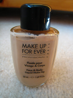
Make Up For Ever's Face & Body for my new foundation, which is a really awesome and unique product. The foundation is oil-free and looks kind of like watered down jello in the jar (that's in a good way). On skin, F&B is sheer and very light feeling, and once dried, the foundation almost entirely disappears/melts into your skin. The result is a slightly better version of your skin on your face, which is exactly what I wanted. The downside to this sheerness is that the foundation has a hard time covering any major blemishes if you apply with a light hand. If you layer on the foundation though, you can make most blemishes look a lot less obvious if not entirely invisible. Another great thing about F&B is that it does not oxidize as the day goes on, so I never look like an orange version of myself by the end of the day.

Unfortunately, the foundation is still far from perfect. Perhaps because the foundation retains moisture well (as evident by the fact that it looks natural and never cakey), it does not agree with my oily T-zone and causes my face to be more oily than usual when applied. In addition, the closest color I've found to my natural skin tone (20) is still a bit yellow for me, so the limited color selection may drive some other people away as well. I also wish the foundation comes in a pump bottle since there were definitely a couple of times when I accidentally knocked over the bottle and spilled foundation everywhere.


Since I'm almost out of my F&B and I wanted to try something else, I went out and got Dior's Diorskin Nude Natural Glow Liquid Foundation at Lord & Taylor a couple of weeks ago. Similar to F&B, Diorskin Nude is known for looking natural and has also received a good number of positive reviews. The two foundations differ in that Diorskin Nude is a bit thicker than F&B, which means that it covers a bit better but also runs a higher risk of looking cakey, especially during the dry winters here. I've found that if I apply this foundation on top of my Shiseido White Lucent sunscreen, my face will look extremely cakey and dry. Since the foundation already has some sunscreen, I've opted to apply it directly over my moisturizer, which gives a much more natural finish. So far, I haven't had any problems with oxidation using Diorskin Nude, and my face is still at a normal level of oiliness by the end of the day. Diorskin Nude also wins over MUFE F&B in its packaging; I don't care that it's a hassle to get the last bit of your foundation out of a pump bottle, it is still much less wasteful than the F&B packaging with no pump bottle, which means major spillage for a klutz like me.


One problem I found with the Diorskin Nude after using it for a couple of days is that the color I chose (023) looks too red/orange on me (which goes to say, never trust department store lighting). After checking the color descriptions on Sephora.com, I realized that 023 is a peachy beige, which definitely does not describe my skintone. I'm thinking 020 neutral beige may work better so I will update once I get around to exchanging my foundation. (UPDATE 2/8/10: I went to Sephora last week and tried out the rest of the lighter colors in the line and all of the colors available are either too dark or too pink on me. I think I'll be going back to my MUFE foundation for now unless I spot a better alternative in the next couple of weeks.)


Now moving on to the powders...After my L'Oreal powder fiasco, I decided to try MUFE's HD Powder due to the numerous rave reviews. It imparts a very slight sheen to the face when applied and gives a soft focus kind of effect. Unfortunately, it doesn't do anything else and especially does nothing for my oiliness. I gave it a couple of weeks and tried different methods of application (brush vs. powder puff), but I soon gave up and moved on to another powder.
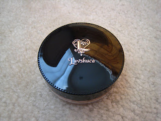

I next purchased Lavshuca's Finish Powder in Lucent after reading the positive review on A Touch of Blusher. Compared to MUFE HD, Lavshuca has the additional benefit of being able to slighty mask pores, but it also doesn't control my oiliness. There is a matte version of the Lavshuca Finish Powder that is more geared towards oil-control (A Touch of Blusher mentioned that the matte version does control oil slightly better) but I'm not a fan of completely matte powder so I decided to pass on that.


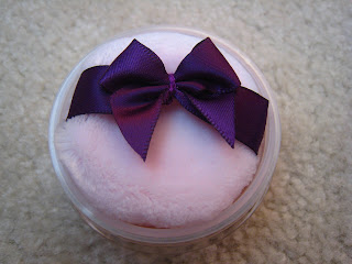
One thing I love about the Lavshuca Finish Powder is its packaging. The original packaging for the Finish Powder (might've been called something else previously) was even more princessy, but this new packaging still looks very girly. I especially love the cute powder puff which adds a very nice touch to the product.


I have a couple of words to say about a some other products that I've tried very briefly or only through testers so I don't have product pictures.

Tinted Moisturizer - Dior HydrAction Deep Hydration Skin Tint SPF 20

I heard about this product through a friend who raved about how it covers everything but still looks extremely natural. I picked up a tester sample from Sephora of the lightest color (00? 01?) and it sadly didn't work for me at all. I felt like it didn't cover anything when applied sheerly and looked extremely cakey when applied generously. The color selection was also very limited so the lightest color was too light for me but the second lightest was way too dark.

Concealer - Neutrogena SkinClearing Oil-Free Concealer

I was having serious skin problems for a period of time last year so I picked up this concealer to cover my pimples/acne. The good thing is that it didn't irritate my breakouts so that they become worse, but I can't say that the concealer helped cure my breakouts either. The other downside was that this concealer looked very cakey and unnatural if I had patches of dry skin due to the acne medication, so I ended up throwing it away after a while.

Face Primers - Bare Escentuals Prime Time Foundation Primer Oil Control, Laura Mercier Oil Free Foundation Primer, Urban Decay Complexion Primer Potion for Pore Perfecting, Korres Face Primer

I've read on a number of makeup blogs that primers is the way to control oil, not powder. However, I have very little faith in face primers since all that I've tried (Smashbox, MUFE UV Primer, etc.) have failed me or exacerbated the problem so far. Still, after trying the HD Powder and still having no luck controlling my sebum secretion, I picked up a few more primer testers from Sephora. Both the Bare Escentuals and Laura Mercier primers I got because friends recommended them, and I got the Urban Decay primer because UDPP works really well on me. Unfortunately, all of them failed miserably at the oil-controlling aspect for my face. Even though the UD primer isn't specifically geared towards oil control, it was still a failure in that it didn't cover up my pores as advertised. I got the Korres primer as a sample for an online order, and it also wasn't any good at oil-control, but it was more geared towards moisture-retention anyway so I don't really blame the product. There is one amazing thing about the Korres primer, though--it makes my skin feel very supple, soft, and smooth without that silicone feeling you get with a lot of primers. I wish it would work with my oily skin since I truly love the finish, but this primer might be for you if you have dry skin.

In short: Make Up For Ever Face & Body - sheer and very natural-looking but limited color selection and not good for oily skin. Diorskin Nude - fairly natural-looking, still waiting to see if there's a good color match. Make Up For Ever HD Powder - doesn't do much, especially no oil-control. Lavshuca Finish Powder in Lucent - slightly masks pores but also little oil-control.

Chanel Mystic Eyes (It's CHANEL!)

Chanel has always been one of those god-like brands to me. To buy anything Chanel is to take the first step into the world of fashion. Of course, not everything Chanel is perfect, but it seems like even the imperfections are god-like. You can never go wrong with Chanel. (I mean just look at this paper box! If it wasn't Chanel then it would be boring, but because it is Chanel, the box automatically becomes classy.)


Since I don't really want to spend a month's salary on a Chanel bag just yet, a Chanel's makeup item seems like a good alternative. Thus, when I saw the beautiful promotional picture for Chanel's winter 2009 eyeshadow palette, my mind went *ding* time to pick up a Chanel quad. The minute I swatched Bird of Paradise from Chanel winter 2009 on the back of my hand, I absolutely fell in love with the shimmer quality. There is one downfall, Bird of Paradise is really colorful, and as I've (recently?) learned, my colorful eyeshadows mostly just sit in my drawers and are almost never used. Thankfully, as I swatched a few more of Chanel's quads, I found that a number of Chanel eyeshadow quads have the same beautiful shimmer, including spring 2009's Mystic Eyes. And that is how I ended up with Chanel's Quadra Eyeshadow in Mystic Eyes ^^


Back when Mystic Eyes just came out, I read a number of rave reviews on the insanely gorgeous taupey palette. Unfortunately, I was only working part time at the time so I refrained from making any expensive ($20+) makeup purchases. I'm very glad then that the Bird of Paradise promotional picture eventually led me to Mystic Eyes again because as the other reviewers say, Mystic Eyes is truly an INSANELY gorgeous taupey palette ^_^


The packaging for Chanel eyeshadow quads is not particularly exciting, but it looks very classy and Chanel-esque to me. As with other high-end brands, Chanel's quads come with a velvet pouch to protect the palette (see above). I always keep the velvet pouch because it looks nice, but the pouch also annoys the hell out of me because it attracts dust like crazy. The quads also come with a sturdy plastic protective covering and two sponge-tip applicators that are so-so in quality.


The eyeshadows in the Mystic Eyes quad are incredibly silky and finely-milled (as are all of the Chanel eyeshadows that I played with at Nordstrom). The lasting power is great, no complaints yet, and the shimmer that I previously mentioned is just out-of-this-world amazing. The shimmer here does not scream party girl but instead oozes sophistication from every little speck. The reason why I love it so much is due to the mix of very fine to fine shimmer that provides a spectrum of reflectivity and gives depth and dimension to each color. Unfortunately, my camera was not able to capture the shimmers well in any of the pictures, so you will just have to take my word for it until you are able to check out the quad in person at your local department store! I chose to provide two product photos below because the left picture (taken partly in the shade) is closer to the actual color, but the right picture (taken in indirect sunlight) shows the level of reflectivity based on the amount of shimmer in each color.


The four colors in Mystic Eyes are a very very pale vanilla pink (A), a slightly coppery medium brown (B), a silvery taupe (C), and a blackened chocolate brown (D). A and C are both on the sheer side but B and D are both very pigmented. There is some level of shimmeriness in all colors but I would say that D is more than 50% matte and A and C are the most shimmery of the bunch. These colors applied together creates a very (surprise surprise) sophisticated and classy look appropriate for both the office and weekends. I haven't tried to use this quad to create a smoky eye look yet, but I think it would also look beautiful (I imagine something like Marion Cotillard on the red carpet).


All pictures in this post were taken under natural light.

In short: A stunning quad worth every penny.