Monday, August 22, 2011

NARS Douceurs de Paris Artist Palette

While catching up on some old posts on beauty blogs I follow, I came across a review for NARS' Douceurs de Paris (Pleasures of Paris) palette. I had a great experience with NARS Bridal Palette from a while back, and this palette had colors that I love so I thought I would give it a try. Although the fact that it previously sold out due to its popularity and was somewhat recently revived was another deciding factor.


The packaging for Douceurs de Paris is the same as any other NARS eyeshadow/blush packaging. There is a mirror included, but no applicators or brushes.


The texture of the eyeshadows are extremely silky and smooth, with the exception of the bottom right shade, which seems a little rougher and drier. The pigmentation level of all shades is excellent, as expected of NARS products. I will have to update later on the staying power since I have not yet used these on my eyes. Though from my previous experience, NARS eyeshadows tend to fade on me after 6-7 hours even with UDPP.


The shades in Douceurs de Paris are (from L to R) Nepal (peach), Violetta (violet), Demon Lover (purple), Fez (bronzey brown), Abyssinia (ivory), and Cordura (black brown with gold specks). Nepal, Fez, Abyssinia, and Cordura are shimmery, while Violetta and Demon Lover are matte. My favorite shade in this palette is Nepal, which is a bit sad since I already have the same shade in the NARS Bridal Palette. Hopefully I will grow to like the other shades better once I've had a chance to actually use the palette though.

All pictures in this post were taken under natural light.

In short: This palette delivers what I expect from NARS, silky eyeshadows with great pigmentation level. I can't say that I was blown away after seeing and touching it in person though.

Tuesday, August 16, 2011

Beaute de Kose & Paul & Joe Eye Glosses

Ever since I started following beauty blogs, I've read rave after rave of Beaute de Kose's eye gloss Eye Fantasist. I've never been a big fan of cream/liquid eyeshadows since they seem to all crease on me no matter how crease-resistant they purportedly are. Still, I was tempted to try out the Eye Fantasist line because of the gorgeous sparkles I have heard so much about. I was completely heartbroken, then, when I heard that the Beaute de Kose line was to be discontinued. Thankfully, my beautiful cousin snatched a couple up when she traveled to Asia last year and was kind enough to give one to me. This then started my collection of eye glosses from different brands.


The packaging of the Eye Fantasist line is a very cute teardrop shaped tube. Some limited edition colors also have charms attached to the tube. Within the tube is a very simple sponge tip applicator. The lasting power is excellent for liquid eyeshadows, but it still sometimes creases at the end of the day if it's hot. The color that I got was BR350.


After getting the Eye Fantasist, Paul & Joe's Eye Gloss Duo released for summer 2011 also caught my eyes. The double ended tube is decorated with the typical Paul & Joe logo flowers. Each end contains a sponge tip applicator, with the applicator on the purple end being slightly thinner. The staying power of the Paul & Joe Eye Gloss is on par with the Eye Fantasist. Similarly, I sometimes still experience creasing at the end of the day if it is hot outside. The color that I got for the Eye Gloss Duo is 03.


The two swatches on the left are for the Paul & Joe Eye Gloss and the swatch on the right is for the Eye Fantasist. I would describe the P&J colors as a cool silvery lilac and a cool light pink. The shimmers in the pink color are fairly chunky so you can definitely see the individual pieces. The lilac has more of a metallic texture with very fine shimmers and more color pay off. I like using the lilac for an office-appropriate look, but the pink is a little too loud for a conservative work environment.

The color of the Eye Fantasist is a slightly purple red-tinged brown. This Eye Fantasist has more sparkles in different sizes than either color in the P&J eye gloss and the color is also more complex. Like the pink in the P&J eye gloss, this Eye Fantasist is not appropriate for the office, but it is a truly gorgeous color that can be used during the day or for a night out. Currently, it's my favorite out of the three shown in this post ^_^

All pictures in this post were taken under natural light.

In short: If you like sparkles and liquid eyeshadows, the P&J Eye Gloss Duo is something you shouldn't miss out on. As the ultimate queen in sparkle-dom, you should also snatch up some Beaute de Kose Eye Fantasist if there are any left in stock in your area. Beware that both eye gloss products are pretty pricey though.

Dior Summer 2011 - Rosy Tan Palette

After working for a couple of years now, I've realized that the most practical eyeshadow purchases I've made are nude/brown eyeshadows because they go well with my complexion and are a no brainer when it comes to application. That explains how I was drawn to Dior's Rosy Tan 5-couleur palette released for summer 2011. I can't say that the colors are unique, but I don't have a similar combo palette, so I decided to invest in it. I have not regretted the purchase, and it's definitely a much better color choice than the first Dior palette I bought, Petal Shine.


I don't believe anything has changed with the packaging or applicators since my first Dior palette review, so I won't say much. The style of the packaging is just okay in my opinion, and the applicators are just as crappy as any drugstore applicator.


The texture of the eyeshadows in the Rosy Tan palette feels finer than the texture of the shadows in Petal Shine from what I can remember (I've since given away Petal Shine so I can't say for sure). The dark liner shade is a tad grainier, but nothing that I can't live with. The color of the shadows on skin are also fairly true to what they look like in the pan except for the bottom left color. It looks taupey in the pan, but actually shows up as more of a bronze. The pigmentation of this palette is MUCH better than what Petal Shine had to offer though. The staying power is also pretty decent over UDPP, no issues with creasing when wearing it for a full work day.


The colors in this palette are (from L to R), an ivory, a cool pink, a bronze, a soft beigey brown, and a dark brown. All of the shades are fairly shimmery except for the beige brown color, which has more of a satin finish. The combination of the four nude/brown colors provides the basis for a simple, elegant look, but the pink adds in a shot of girliness.

All pictures in this post were taken under natural light.

In short: A worthy investment if you're a fan of nude/brown eyeshadows like myself.

Monday, February 21, 2011

Massive Fyrinnae Spam

I bought these Fyrinnae shadows last summer, and I really should've also reviewed these shadows then because that's when I took the swatch pictures. Since I don't recollect the feeling of seeing these shadows in person, I'm just going to post the swatch pictures without descriptions. Feel free to leave a message if you are really interested in certain shades and would like a word description.


In short: Fyrinnae is still awesome, but I'm starting to feel color overload...

Sunday, February 20, 2011

Lavshuca Fall 2010 & Spring 2011

For once, I am about to review an eyeshadow palette within a month (or two) of its release!! I picked up one of the fall 2010 Lavshuca eyeshadow quads late last year, but my cousin also got me a spring 2011 Lavshuca quad when she recently went on a trip to Asia. As such, in this post, I will be reviewing Lavshuca Melting Eyes in RD-1 from fall 2010 and Star Decoration Eyes in GN-1 from spring 2011.


The Melting Eyes series received a lot of rave reviews when it was released in Asia last year. All of the colors in the series are variations on nude/brown, which is the most versatile and also possibly most loved color combination for Taiwanese/Japanese bloggers. The packaging is made of a sturdy plastic, and the princessy design is typical of Lavshuca.


Also typical of Lavshuca, the palette comes with a double ended applicator with one rounder end for the lighter colors, and one pointier end for the darkest shade. The quality of the applicator is okay but not anything to write home about. The lack of a mirror is also a shame, but not particularly surprising.


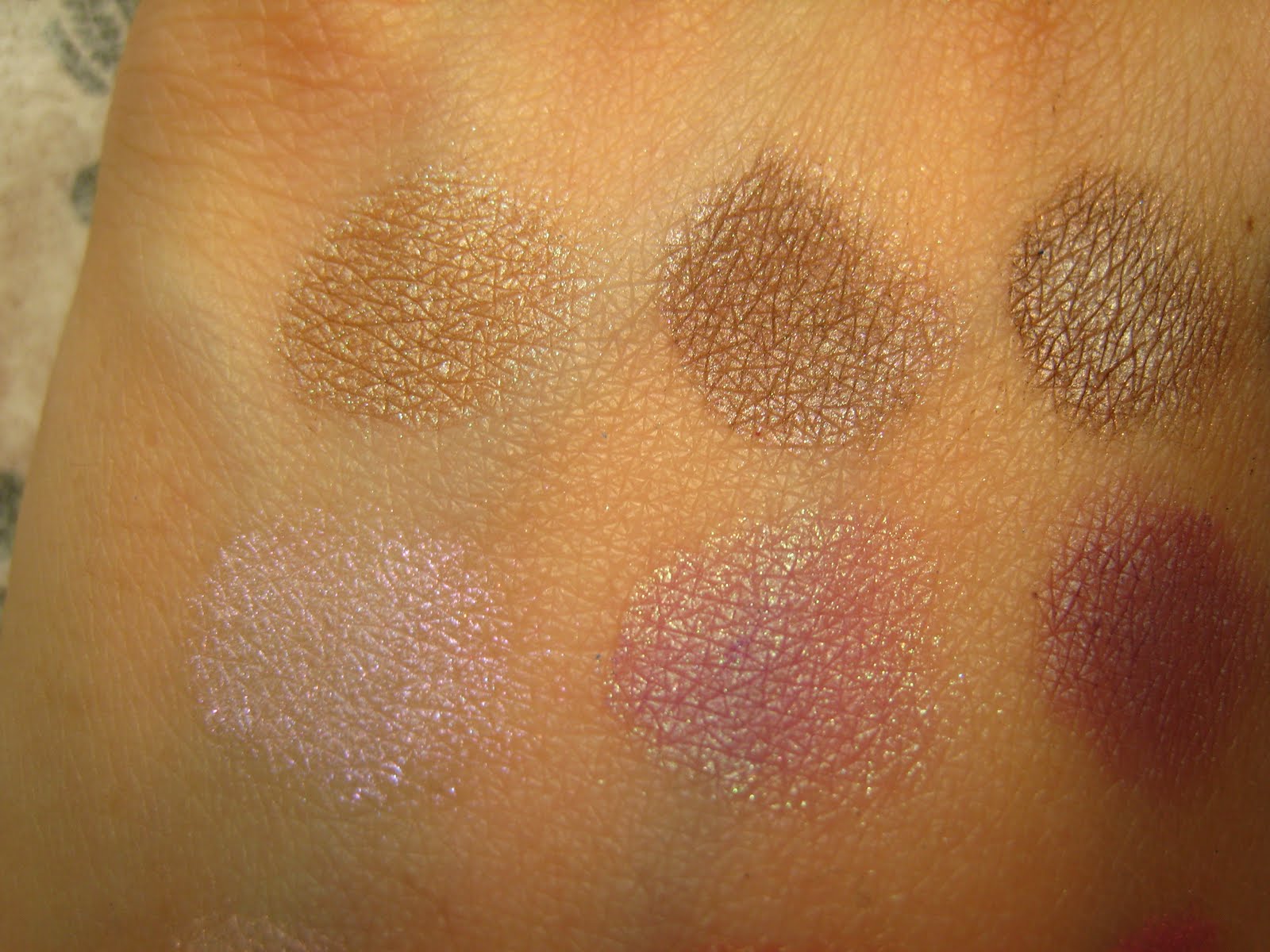
The colors of Melting Eyes in RD-1 are a pale nude gold, a pinkish rose gold, a light bronze copper, and a medium dark chocolate. All shades are shimmery, though not overly so. The powder is finely milled with a semi-moist texture typical of many Japanese makeup brands, and the color payoff for all shades is sheer to medium. As a result, it is impossible to do anything dramatic with this palette. The overall look is very OL and what I would describe as 姐姐風的溫柔感 (the closest equivalent I can say in English would be a grown-up and feminine).

Now moving on to the Star Decoration Eyes in GN-1...


The Star Decoration Eyes series is set to replace my favorite Lavshuca line, the Eye Color Select quads (the ones that look like tulips/hearts). The packaging (other than the fake gem at the top) is certainly prettier, but I am thankful that I am not in any danger of using up my Eye Color Select quads any time soon.


Like the Melting Eyes series, the Star Decoration Eyes series also comes with the typical double-ended applicator and no mirror. I think the layout of and design on the eyeshadows are prettier than those of the Melting Eyes series though. (Sorry for the washed out picture, I couldn't find a good balance between too bright and too dim under the sunlight)


As you can see in the above unfocused flash picture, the Star Decoration Eyes quads are very shimmery. I have only seen this color in person, but looking at the pictures on other blogs, I'm pretty sure the other colors in the series are the same. The amount of shimmer in this quad is definitely higher than the amount in the Melting Eyes series, and possibly also the Eye Color Select series.


(*UPDATE* Uploaded a new swatch picture above.) The colors in this quad are a silvery white with pale gold glitter, a straight silvery white, a pale grassy green, and a medium olive brown. It is unfortunate that the color payoff in this quad is not quite as good as the Eye Color Select line, but the texture of glitter shade is definitely better than the that of the glitter shade in Eye Color Select quads (for comparison sake, the pigmentation level is on par with my Melting Eyes quad). The glitter shade in Star Decoration Eyes GN-1 consists of a very finely milled base color combined with a non-gritty glitter. The glitter may be more aptly named as shimmer flakes since the texture is the same as the shimmery base except you can see that the glitter comes in bigger pieces.

I have not yet used this quad on my eyes (that's how new this is!!), but the color combination is very mori kei and fairylike/elfish to me. This quad is definitely not what I would consider as office appropriate, but I think it will be nice for the weekends come springtime ^_^

The product pictures for Melting Eyes in RD-1 were taken under whitelight, while the rest of the pictures were taken under natural light. The flash picture for Star Decoration Eyes in GN-1 obviously had some help from the flash on my camera though =P

In short: I was not completely wowed by these two Lavshuca palettes, though they both have their own merits. One thing is certain, Lavshuca is definitely not for you if you consider yourself a MAC girl or like very pigmented eyeshadows.

Dolce & Gabbana Smooth Eye Colour Quad in Nude

I have a lot of makeup posts to catch up on ^^"' Although my makeup buying has slowed down in the past few months, but my makeup reviewing speed has slowed down even more. As such, what better time to catch up than during this long weekend? ^_^


One of the items that I bought last fall/winter (don't remember the actual month) was the subject D&G eyeshadow quad. I became interested in this new brand to the makeup world due to the number of rave reviews it was getting on its eyeshadow duos. However, because I'm more of a quad kind of person, I decided to pick up this quad in Nude to try out the brand. Although this brand has not displaced Chanel as my No. 1, I would still highly recommend trying out D&G's eyeshadows if you are interested and have the budget.


The outside packaging of the D&G shadows is not particularly interesting, but it does remind me of Chanel ^_^ Also, as usual for department store brands, the D&G quad comes with a handy velvet protective pouch. It's unfortunate that it collects dust so easily though ^^"'


Based on the pictures I saw online, I thought I wouldn't like the case for the D&G quad because of the gold color. When I received the product though, I was pleasantly surprised that the case actually looks classier than I thought it would be. The gold is not overly yellow and the case is a semi-matte finish, so the packaging says glam but not garish.


Also typical of department store brands, the quad has a sturdy plastic cover for the eyeshadows so the powder wouldn't get the mirror dirty. The quad also comes with two eyeshadow applicators. I didn't bother try using them so I can't say for sure if they're good or not. The fact that I didn't even bother trying them out probably says a lot though about my faith (or lack thereof) in their quality.


The Nude quad consists of a matte nude, a matte mauve, a shimmery pale peach, and a shimmery blackened plum. The two matte shades are extremely smooth, and are of comparable quality to Bobbi Brown's matte shadows. The peach color is also finely milled and very smooth, but the plum is a tad grainier. The color upon initial application is sheer, but can be built up to a medium level of pigmentation (i.e., better than Guerlain Midnight Butterfly, but not quite as pigmented as the typical MAC/BB eyeshadow). I would say that the overall quality is pretty typical of high end department store brands.

The colors of this quad equals retro chic in my mind. The way Scarlett Johansson looks in the ads for D&G makeup pretty accurately portrays my image of this quad. Like Hollywood in the 50s, Nude is very classy and glam, though the peach also brings in a touch of playfulness. This quad is very office appropriate, but I think it could also make a great party look if you're going for a retro chic look.

All images in this post were taken under natural light.

In short: If your budget is up for it, this D&G eyeshadow quad is a worthy investment. Nude exudes an aura of class and glam reminiscent of old Hollywood.

Friday, February 11, 2011

Giorgio Armani Sheer Blush #2: HG Status?

NARS Orgasm was my holy grail blush for a while because of the natural flush it imparted. However, when my face started breaking out more often last summer, I found that I needed a more low key blush than Orgasm so that I don't draw attention to my pimples. After reading up on various blogs, I settled with trying out Giorgio Armani's Sheer Blush #2, and I have not looked back since.


The packaging for GA's Sheer Blush is a black cardboard box that looks very eco-friendly. The case for the actual blush is a matte plastic case that exudes a certain class and status. The lack of any decoration and the subtle contouring of the simple round shape screams Giorgio Armani to me.


The color of #2 is a very pale peachy nude pink. The color is extremely sheer, but it is buildable to a noticeable degree. The great thing that I love about this blush is that no matter how heavy-handed you are, it is impossible to make this blush look garish. For darker skinned girls out there, this is probably not the best blush for you because it is so sheer and light. It is, however, HG stuff for pale-skinned ladies who find that they often over apply their blush.


Although the blush looks matte from the pictures I saw online, it is actually very slightly shimmery. The level of shimmer is nothing compared to the amount in NARS Orgasm, but the fine shimmer here still gives my skin a certain glowiness when applied. I've found that this blush is probably the longest lasting blush that I have tried to date (I haven't tried that many blushes, just NARS and L'Oreal) and the powder is also the finest and smoothest.

All pictures were taken under natural light.

In short: I love Giorgio Armani's blush! It's not for you if you need/like highly pigmented blush, but this is perfect for pale to light skinned gals looking for an everyday blush. That is, if you don't mind the price...

Chanel Winter Nights

If you asked me a year ago, I probably would've said that there's no way I would ever become a department store makeup snob. I was just as happy with drugstore makeup as I was with department store makeup. Unfortunately for my bank account, that has changed, and Chanel is one of the culprits. I don't even bother going to the drugstore to check out their new collections anymore; Chanel is my new love and no brand can supplant Chanel's position in my heart. With that said, late last year, I bought a Chanel palette that's been out for quite a while, though I didn't fall in love with this palette until this past May when I took a trip to NYC. I don't know how I've overlooked this palette in the past, but I'm glad that I decided to stop at the Chanel counter at the NYC Bloomingdale's for this fateful encounter with Winter Nights.


There's not much to be said about Chanel packaging. It's been the same for years and years and it's become a classic. It's not exactly the prettiest or cutest packaging ever, but it's classy and it's very Chanel so I don't have any complaints.


As usual, the inside contains a very sturdy plastic separator and two very crappy eyeshadow applicators. Chanel quads would be completely flawless in my heart if they had more decent applicators. Seriously, even some drugstore applicators are better than these.


No complaints about the powder quality. In fact, the powder quality is one of the reasons why I love Chanel so much. You may want to refer to my previous post on Chanel's Mystics Eyes to see why, but suffice it to say that Chanel's eyeshadows are super finely-milled.


The colors in this palette are a medium neutral-warm brown, a light beigey yellow, a pale pink, and a dark blackish olive with gold shimmers. All of the colors are shimmery or at least have a subtle sheen. Another reason why I love Chanel quads is the beauty of the fine shimmers in their shadows. There is nothing garish or loud here, but a sprinkling of shimmer in the colors like stars in the sky. As my swatch really does not do the shadows justice, please check out the palette at Chanel counters to see what I mean.

Overall, Chanel Winter Nights is a sophisticated yet fun palette. The color combination is not boring, but the effect is understated and elegant when the colors are combined on my eyelids. From the promotional pictures of the spring Chanel palette, it seems that Winter Nights is similar to the new palette Regard Perle. However, the brown and dark olive in Winter Nights is replaced by a vanilla and forest green in Regard Perle, respectively. I haven't checked out Regard Perle in person yet, but it seems like a lovely palette as well.

It's been a while since I took the pictures, but all pictures should have been taken under natural light.

In short: A worthy purchase if you like elegant, understated colors, and don't mind the price!

Wednesday, September 1, 2010

Coffret D'or Lipsticks from Spring 2010

It's official. I am in LOVE with Coffret D'or's lipsticks. Over the past few months (NOTE: I wrote this in June...), I've been branching out more into the lip makeup arena and trying out different brands of lipsticks. Because my lips are dry and very pigmented, there is a very small population of lipsticks that work well on me. Plus, I don't like lipsticks that completely cover up my lipcolor (unless they are nude-colored) because I think the effect looks fake, so my selection is even more limited.

After going through the reviews, I picked out a few brands (Dior, Maquillage, and Coffret D'or) that are really popular with the Asian crowd since I tend to identify more with their makeup style. I first tried out Dior Addict High Shine Lipstick because it was the easiest to get in the US. The Dior lipstick wasn't bad, but it was still a bit dry for me and contained shimmer/glitter bits that were too rough. Then, I tried a Maquillage Spring 2010 lipstick, which was definitely creamier/more moisturizing. Still, the shimmer/glitter bits were too scratchy for my liking. Finally, I tried Coffret D'or (CD), and although it's not extremely different from MQ, it has become my favorite.


The packaging for the Spring 2010 line of CD lipsticks is pretty simple and sleek. I'm sort of on the edge about the design, so I don't particular like it but I don't hate it either. The one thing that's annoying about the packaging is that I can't tell which lipstick is which from the outside unless I read the label. I guess that's a minor problem right now since I only have two of these lipsticks, but it would be a nuisance if I buy more and I have to pick up every one of them to check the label.


Previously, I mentioned that the CD lipsticks are not that different from the MQ lipsticks. The minor difference between the two is that CD lipsticks are slightly more moisturizing and doesn't accentuate lip lines as much. I still have a slight problem with the roughness of the shimmer in certain shades of CD lipsticks, but it's minor enough that I can live with it.

The two colors that I bought from CD's spring 2010 Aqua Rouge line were PK 247 (right swatch in below pictures) and PK 248 (left swatch in below pictures). I was originally looking for a versatile neutral pink, and PK 248 seemed like the most neutral color out of the PK series. However, the color turned out to be a neutral-cool medium pink color that's fairly pigmented. I wasn't completely in love at first with the color since it seemed too bright for me, who is used to muted lipcolors, but after working with it, I'm liking the color more and more. In fact, now I love the color when I don't feel like wearing too much eyeshadow since it really brightens the face.

Swatch picture taken in direct sunlight:


Side note: For those not yet familiar with Asian/Japanese lip product naming, PK stands for pink, OR is orange/peach, BE is beige/nude, and BR is darker nude/brown.

I bought PK247 during the phase when I was still experimenting with PK248. I wanted a more muted pink for makeup looks that focus on the eyes, and PK247 was a perfect choice. It's a nude, almost beigey pink. With my pigmented lips, the color looks pinker on my lips than it does on bare skin, but I very much like the effect.

Swatch picture taken in indirect sunlight:


In short: Coffret D'or lipsticks are a great choice when you're looking for moisturizing lipcolor that's not completely opaque. At $28 a pop, they are a bit pricey, but worth the money IMO.

Wednesday, August 18, 2010

Inspiration - Chanel Inimitable Promo

During the past year or so, I have slowly developed into a devoted Chanel fan. I used to love Dior and Guerlain and think that Chanel is boring and for old people, but my attitude has changed 180 degrees. Now, I am in love with the texture of Chanel eyeshadows and blushes (haven't bought one of their blushes yet though) and am curious to try Chanel lipsticks (though I don't really want to spend $30+ on a lipstick since I don't use them very often). In any case, I guess my love for Chanel extends to their promo pics because I am totally in love with their promo pic for the recently released Inimitable Mascara. Though honestly, the foundation/powder on the model's face looks too thick to me when you see a larger version of the picture, but her eye, blush, lips, and hair are just gorgeous. I wouldn't be surprised if her eye had some help from false lashes, but I think half the beauty is in the color of her eyes, which has nothing to do with makeup, of course. I guess it helps that Chanel finds pretty models 'cause this makeup look can make a normal person look like a ghost =P (...it sounds like I'm not really giving much credit to the makeup artists at Chanel...)